

Delivered 70+ wireframes across 2 product iterations, contributing to the Amazon Robotics 3.0 design system and collaborating with 25+ engineers and 3+ TPMs to launch updated software versions.
Timeline
May–Dec 2025
Role & Team
Zikki: UX Co-op, with 2 Senior UX Leads, a UX Design Manager, TPM and SDE partners
Responsibility
Design Audit · Wireframing · UX Testing · Survey Design · Pattern Documentation
Disciplines
Research: Comparative Audit · A/B Testing · Survey Design · Data Analysis
Design: Interaction Design · Multimodal Feedback (Screen, Sound, LED) · Design System
Tool: Figma · Qualtrics · Internal AI Tools
It became three connected projects, each a step bigger than the last: a shared pattern on the screen, a harder one that needed the station’s hardware, and a self-serve kit that helps designers stay consistent without waiting on reviewers. Across them I delivered 70+ wireframes over 2 product iterations.
Same task, different on every station
When the same task looks and works differently on each workstation, associates relearn it every time they move. That means slower units per hour and more errors. And the problem keeps growing: there were 8 types of workstations in 2025 and 11 in 2026, each built for a different job.

Workstation A

Workstation B
Both workstations confirm a scan with a toast, in different places, colors and sizes.
To find where to start, I audited 300+ wireframes across 7+ workstations and found 8 tasks they all share. Scan came first: it’s a high-frequency action associates repeat on every workstation, which made it a good starting point for a repeatable way to standardize UX patterns. Place came second, as the natural next step after scanning.
01
02
01
Scan feedback
Duration
May–Dec 2025
Team
UX Design Manager, Senior UX Lead, Sr. TPM, SDM, SDE II
My role
Design audit, 2.5 iteration design and handoff, UX pattern testing and documentation
Every workstation confirmed a scan in its own way, and the pilot workstation was moving to scanless technology with no clear notices for case types or edge cases.
A border made the result faster to read
I audited scan feedback across 4 workstations, then designed three versions for the pilot: a toast, a toast with a border, and a full-screen color. Under the UX Design Manager, I handed off 12 wireframes to engineering and product, and we compared the versions in 3 rounds of testing with associates.
A
Toast


B
Toast + border
Fastest


C
Full-screen color


Each version shown with a correct scan (left) and a wrong item (right).
Result
The toast with a border and a light background was the fastest to read. The redesigned workstation shipped with this pattern, and it became the first finalized pattern in the design system, now rolling out to every V3 workstation.

The scan feedback pattern, applied on another workstation.

The redesigned workstation in the fulfillment center.
02
Place feedback
Duration
Jul–Nov 2025
Team
Senior UX Lead, UX Design Manager
My role
Pattern proposals, survey design and build, data analysis
After placing an item into a tote, associates got no confirmation, so they paused to double-check. The new scanless speed mode made placing faster, and even harder to check.
Confirm the place on screen and in light
A workstation can respond through the screen, sound or an LED bar. For placement, we chose the UI screen and the LED bar, and kept sound for the scan.

UI Screen
The necessary channel on every workstation.
LED Bar
Sits right at the tote, where the item lands, so it confirms the action in place.
Sound
Already confirms the scan. Reusing it for placement would blur which step worked.
Three LED schemes: one light or two?
Leadership proposed a dual-LED setup. Building on it, the Senior UX Lead and I designed three LED schemes to test how tote status and placement feedback could share one light, and whether a second LED was really needed.
A
Single LED per tote

B
Single LED, multiple states

C
Dual LED per tote
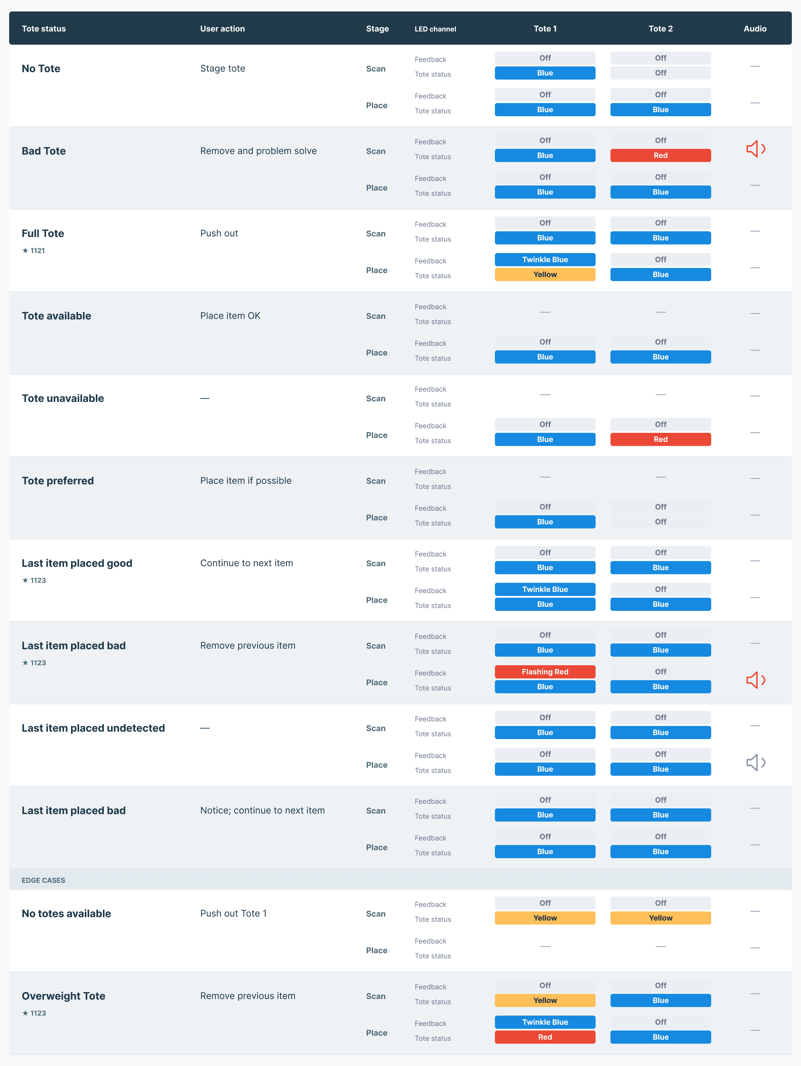
Tested with a video survey, not new hardware
Testing on the floor would have meant hardware engineers building dual-LED setups and wiring the lights, more than the timeline allowed. Instead, I co-designed a Qualtrics survey with video simulations of all three schemes, so associates could react to each one without any engineering time.
1
Learn the light language
Associates first review an LED guide: color carries the meaning, the pattern carries the urgency.

2
Predict the next action
Each question plays a scheme on a real workstation and asks what they would do next.

Result
From 31 survey responses, we validated our hypothesis: a single LED is enough to show both tote status and item placement, so no second LED is needed.
03
Design process and AI auditor
Duration
Oct–Dec 2025
Team
2 Senior UX Leads
My role
Pattern file documentation, modality framework, AI auditor
Every designer on every workstation needed one of two design-system specialists to approve their work before handoff. The specialists became a bottleneck, and while work waited, inconsistency crept back in.
A review process designers can run on their own
With two senior UX leads, we turned the specialist review into a self-serve process: guidelines before design, a brief and flows to define the work, shared patterns to design with, and an audit before delivery.

The self-serve design process. Office hours are only needed when an audit doesn’t pass.
Patterns and a framework to design with
I organized and finalized the pattern Figma file, delivering 12 general pattern pages any team can reuse. I also helped apply the workstation modality framework, which maps each type of feedback to the screen, light and sound. With it, the next version’s end-to-end workflow and wireframes came together in under 3 hours.

Workstation modality framework: the color, component, light and sound each level of feedback uses.
Part of the self-serve kit
AI design-system auditor
I explored the internal AI tools available to us and built a chat agent that checks a design against the design system. I wrote its persona and key prompts and defined the audit criteria, so designers get a compliance summary with prioritized fixes instead of waiting on a review.

The agent’s setup (left) and a real audit of a scan-feedback wireframe (right).
Result
Designers can now go from requirement to a compliance check on their own. Specialist office hours are only needed when an audit doesn’t pass, instead of reviewing every handoff.
What I learned
Work across the whole stack. I moved between research, design and testing, often inside one project.
Think in systems. A pattern has to work on every station, not only the screen in front of me, and what I make should be reusable.
Balance consistency with real constraints. Two LEDs per tote didn’t fit the hardware or the timeline, so we recommended one.
Thank you
This co-op was an incredible opportunity to learn.